How to ideate A/B tests using data from Google Analytics
To set up the best possible A/B test, it’s essential to understand how to leverage data in Google Analytics.

Alex Arevalo is the co-founder of Gold Tree, a conversion rate optimization and SEO digital marketing agency. Alex was a product manager at Snapchat and now shares what he learned from Silicon Valley leaders with the rest of the tech community.
What is A/B testing?
A/B testing is the practice and implementation of showing visitors two or more variants of an ecommerce website or application.
The goal is to collect data and identify which of these variants performs best in a vacuum-controlled environment, and then implement it in the real world on your ecommerce store.
By the end, you should have it narrowed down to one winning version of your website that will create more loyal, long-term visitors.
Another phrase for an A/B test is a "split test."
You can also think about an A/B test as a means to improve your "conversion rate optimization, or CRO," through the act of identifying the exact changes that will optimize conversion for your ecommerce business.
Learn more about A/B testing.
A/B testing in action
Say you have a homepage on your website with a big yellow button that reads "CLICK ME".
A/B testing targets that specific variable, the Click Me button, on your homepage and changes small aspects of it, such as the color (variables = CTAs, banners, copy, headers).
There are many ways to play around with this, but one test idea might look like this:
Original = yellow button "CLICK ME"
Variant 1 = red button "CLICK ME"
Variant 2 = blue button "CLICK ME"
While conducting A/B testing, it’s important to keep in mind your business’ primary goals.
For an ecommerce site, the primary goal might be revenue, but for a B2B SaaS software, it may be leads in the sales pipeline.
Whether the goal is conversion, revenue, transactions, interactions, or form submissions, every type of business can benefit from A/B testing.
A reputable agency can help you understand how the process works. In fact, one of the many services offered through Optimizely is A/B testing.
Why A/B testing is important for your business
A/B testing has become the industry standard in ecommerce.
Chances are your competitors are harnessing the power of A/B testing because they know that in order to have a strong online presence, you must first make the most out of every visitor that comes to your ecommerce store.
Your users are your most valuable asset, so they should be treated as such.
This is the key to having a successful business.
In my professional experience, the goal of any A/B testing team should be to increase conversion by 5 percent per quarter, at a minimum.
A 5 percent increase in conversion for some companies can result in thousands, hundreds of thousands, or even millions of dollars in revenue per year, depending on the size and scale of your company.
Through the A/B testing process, you can achieve the following:
- A better understanding of your users’ behavior
- Decreased CPA (cost per acquisition), to save you money and resources
- Increase in conversion
- Decrease in bounce rates
- Increase in traffic volume (SEO A/B testing)
- Prevention of blind design changes
If done well, A/B testing compounds the winning variants to find the optimal version of your online business’ website. The "optimal version" will be a mix of specific text, colors, button placement and overall visual flow.
This in turn leads to the highest conversion rate possible and therefore the best return on investment of your website traffic.
How to set up Google Analytics for A/B testing
For this example, we'll be using Shopify’s CMS.
The first step to running a split test is plugging your Google Analytics (GA) tag into your Shopify storefront.
Shopify has a standard integration built for GA, and implementing this will provide lots of useful information. Go to online store > preferences > Google Analytics.
Standard information you can glean from Shopify GA enhanced ecommerce includes the following:
- Conversion rates
- Revenue
- Buy flow funnel
- Product views and added to cart
- more…..(but this isn’t an enhanced ecommerce article)

To set up the best possible A/B test, you need data that is useful to your business. It’s essential to understand how your users behave on your website.
Below are my top seven recommendations on what to track:
- Scroll depth
- Internal link clicks
- External link clicks
- CTA clicks
- Downloads
- Form submissions
- Social links
If you would like a more detailed explanation, check out our guide on how to prepare for A/B Testing.
Scroll depth
Scroll depth measures how far your users navigate down a page. It is recommended to track the scroll depth at the following levels: 25, 50, 75, 90, 100.
This helps reveal if users are truly engaging with your content and if they are seeing offers, products or forms on your pages.
Internal link clicks
Internal link clicks are the use of hyperlinks to take a user to another page on your website.
It is "internal" because the link clicks stay within your website instead of taking users away from your website.
External link clicks
External link clicks are when a user clicks on a hyperlink on your website that takes them to another, external website.
It is "external" because the user leaves your website.
CTA click
CTAs, or "call to action" clicks include all buttons on your website.
In a nutshell, this feature captures any and all clicks on your website so you can have an idea of the exact pages where clicks occur as well as the text on those buttons.
Downloads
If you have PDFs, video files, or any type of exportable media takeaways on your website, this will track when those downloads occur.
Form submissions
If you have any forms that collect user information, such as an email newsletter signup, form submissions will track where it happened on your website.
This is critical for lead-dependent businesses such as subscription services.
Social links
If you have any social media icons such as Instagram, Facebook or Pinterest on your website, social links will track how many times these are being clicked and on what pages.
How to A/B test correctly using data
The reason you clicked on this article was most likely to understand how to use your Google Analytics account to create the best A/B test possible. Here are some other web analytics tools as well.
In this article, we won’t get into the details of how to implement other A/B testing tools from a technical standpoint, but there are guides available online if you will be using one of those products. Here, we will focus solely on the GA testing tool.
So let's break down where you should be looking in your GA and why.
- Traffic
- Source/Medium
- Browser
- Device Category
- Customer Segments
- Landing Pages
- Conversion rate per page
- Revenue value per page
- Behavior of users who made a purchase
- Number of pages per session
- Behavior Flow
- Top Conversion Paths
- Time Lag Conversion
- Events
Traffic
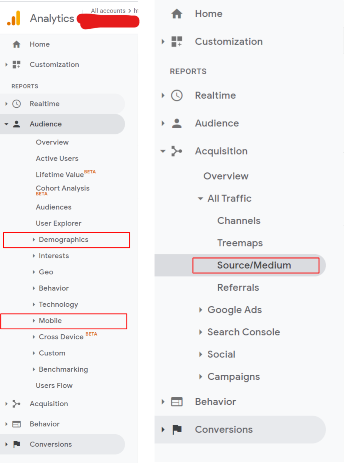
To get the big-picture view of your website, I always love to start with these three metrics: Source/Medium, Browser, and Device Category.
They provide value to us for a handful of reasons.
Source/Medium
Source/Medium allows you to see where your traffic is coming from.
This is important info to have on hand because it will help you understand certain behaviors and high value pages.
For example, paid traffic often behaves differently than organic traffic when it comes to conversion. In general, paid traffic does not convert at as high a rate as organic traffic does.
You may see on average paid traffic only has two pages per session when organic has six.
Digging into the “why” for this occurrence is critical and could unlock potentially limitless opportunities for an A/B test.
Browser
Browser helps you gain an understanding of the browser users are utilizing to reach your site (i.e., Chrome vs Safari).
You can learn which browser is more highly-utilized among your users to ensure you are testing on the right browser after you build your test.
Additionally, you can use this feature to see how each browser is converting.
You don’t need to optimize for Chrome if most of your users are on Safari.
Device category
This is an important breakout.
Device category shows you how many users are on desktop vs. mobile.
As you build tests you should know which device to optimize for, again based on which one is more popular with your users.
Think about it, there is no point in building something that looks best for desktop if 90 percent of your traffic is mobile.
Customer Segments
So now we understand the three high-level categories that tell you about your users: where they are coming from, what device they are on, and where they found you.
The next step is to look into who these people actually are from a "personality" standpoint.
Understanding your users’ traits can help you target specific headlines and imagery to be in line with their preferences.
To find information on your users within GA, navigate to Audience > Interests > Overview
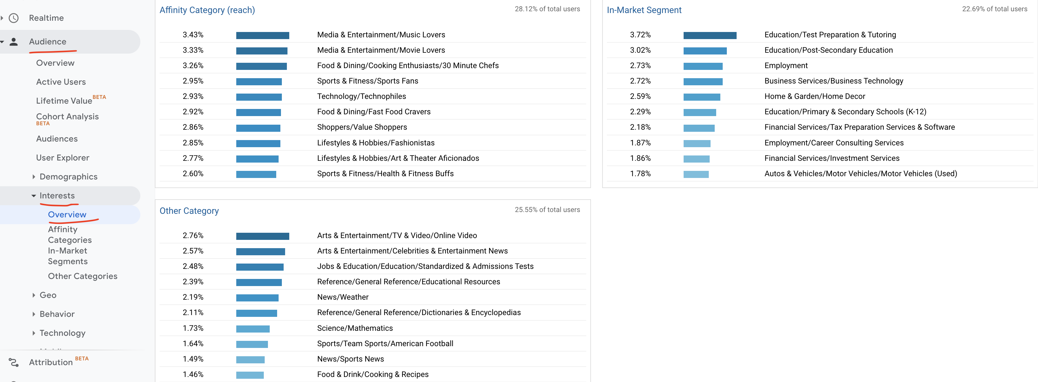
From here you can see breakouts of how GA has defined your users in "categories." Using this information, you can make educated guesses on how to tailor your imagery and headlines.
For example, if Google says your ecommerce store shoppers are "Technophiles," a headline that originally read:
"The Premium Bath Soap Experience"
Might do better as this:
"The Modern Bath Soap Experience" or "Experience the Newest Name in Soap"
Small changes like this can lead to interesting findings.
On the other hand, targeting customer segments with A/B tests may be focused around imagery.
If you know that your users are primarily in healthcare, then instead of using product focused imagery on your homepage, you might instead use imagery of healthcare workers.
This may create a response on your ecommerce site that leads to higher conversion.
Generally speaking, removing your product completely from the page is not recommended, but finding a healthy balance of customer focused content and product content is great for conversion rate.
Lastly, ask yourself if you can define your customers beyond these broad categories. Here are some customer segment examples that are more specific:
- Young gamers
- Professionals in finance
- Parents with 1-2 kids
- Ecommerce store owners
Having this information on hand will ensure you are giving your users a personalized experience when they visit your website.
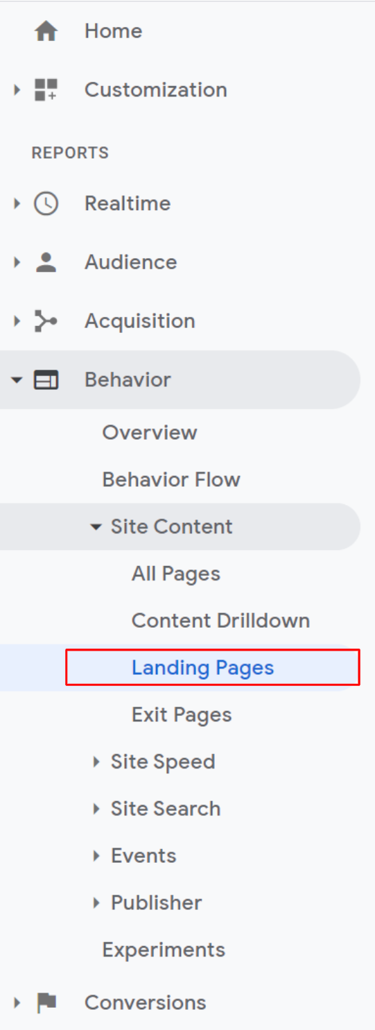
Landing Pages
A landing page is where a user first enters your website.
Your most popular landing page will probably be where you do most of your ad spend.
For example, if you spend the majority of your advertising dollars on sending users to your product page, then you’ll most likely see it ranked in your top five landing pages.
Learn more about Landing Page Optimization.
Conversion rate per page
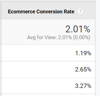
The first thing you should look at under Landing Pages is the conversion rate by page.
This will help you identify trends in the data, including which pages are doing best and why.
Just to note, you will see your conversions drop wherever you dump the most advertising traffic. This goes back to the source/medium of your traffic, again referencing paid vs. organic.
So your homepage may have a lower rate of conversions because you sent 10x more paid traffic there, whereas your product page may have a higher rate of conversions due to all the traffic being organic.
If you do not see conversion rate populating in your GA, you need to ask your engineering team to implement conversion analytics into your GA.
Remember, GA is only as good as you make it.
To summarize, you should identify the top five to seven pages with the most traffic and analyze what is working there and what isn’t. This also helps you prioritize on which pages you should A/B test.
Revenue value per page
Within GA you should be able to review revenue by page.
Here you will get to see the revenue generated by the user who landed on that specific page.
This answers questions like "Is the average order value greater on certain pages than others?" "Are transactions on this page more valuable due to the price of the product or deals being promoted?" and so on.
View behaviors of users who made a purchase
Within Google Analytics you can create segments. Segments are groupings of users based on attributes or behaviors.
For example, you can create a segment of users who made a purchase.
This is extremely useful in allowing you to see the "journey" the paying customers took when navigating your site, versus the journey of the users who were simply browsing.
One key metric we like to look at here is pages per session, especially for this segment of users who made a purchase.
If they made a purchase and their average pages per session is nine (meaning they visited nine pages before buying), how can we decrease the number of pages?
Using GA, you can parse out the pages you may be able to remove, and create shortcuts so you can achieve your conversions more quickly.
Behavior Flow
The behavior flow is one of the most powerful tools in Google Analytics.
It’s going to provide you with a high level overview of how traffic navigates throughout your site. Like before, you can apply segments but also groupings and event breakouts on this page.
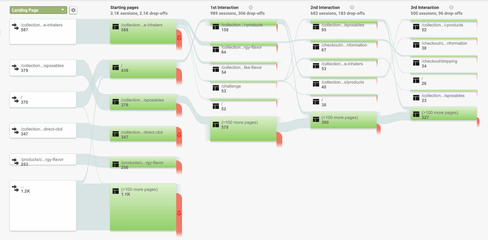
Typically what you want to do is take your highest converting pages and highest revenue pages, highlight or view only those landing pages (right click on the left side), and then start digging into the patterns.
If you see navigation from your homepage > product page > popular page > seasonal collection page > conversion, then there’s probably something unclear to users who are trying to find the seasonal collections page. In other words, their path is too long and convoluted.
The goal is to identify where your site might be confusing to a user and pinpoint the pages in their behavior flow that you can change or remove.
- Identify repeat paths and why they might be happening
- Identify what path users take to convert
- Identify where you are losing users on high-conversion paths
Top Conversion Paths / Time Lag Conversion
Assisted conversion path and time lag are great peaks into certain conversion behaviors.
Learn More about User Flow.
Top conversion paths
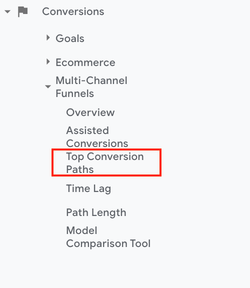
This shows the amount of touch points a user experiences before conversion.
For example, if you see a high conversion path of organic > email, you can hypothesize that users are being hit effectively with winback or follow up emails.
Your conversion paths can help answer the following questions:
- How can you promote what the emails are promoting on the site first?
- Are there offers on the email?
- Can you target the landing page from the emails?
Time Lag Conversion
Time lag is the length of time it took from the first interaction to the conversion.
This helps you understand when conversions may "mature" in their life cycle, and therefore, opens up opportunities for when A/B tests can be deployed to capitalize on these moments.
An example of this may be an offer pop-up that reads "10% off" and is shown to the segments of users who are re-visiting the site between days five through 10.
If you set up the timing of these pop-ups based on these conversion time intervals, you can set up optimal A/B tests.
Event Tracking
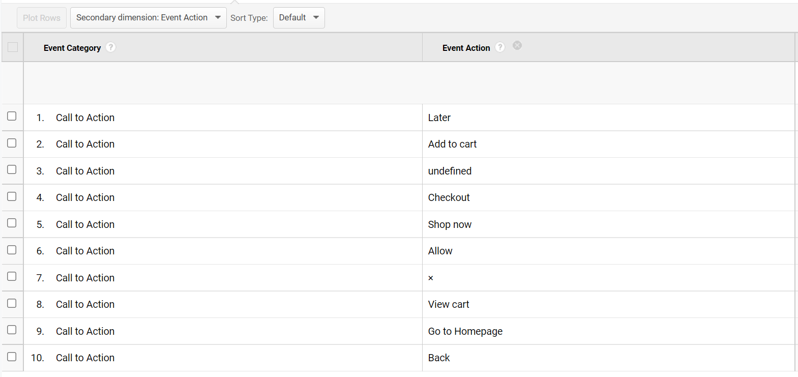
Event tracking is single handedly the most important setup within your GA arsenal.
Events reveal the activity on your pages. Some things that events can tell you include:
- Internal/external link tracking
- CTA clicks
- Social Channel Interactions
- Form Submissions
- Scroll Tracking
- Page Dwell Time
- Video Plays
Each of these events can help identify trends and behaviors. They help you find the answers to questions like the following:
- What is the most clicked CTA on this page? On my website?
- How are people navigating off this page? Via CTA, internal link, etc.?
- Which of my social platforms is gaining the most attention on my website?
- How far down do users scroll on my pages?
With answers to the questions above you can build tests that either reduce friction and therefore get a user to convert, or potentially redirect users to a high converting page.
For example, if you see on a blog post that most users scroll through 50 percent of the page and then navigate to another blog page, you can redirect that behavior by inputting a product carousel or product table at the 50 percent mark to promote navigation to a conversion page rather than a blog page.
Summary
The goal of this article is to show individuals how to act as their own conversion rate optimization expert to boost their online store presence. Keep in mind, an experienced agency will be able to guide you on this journey if necessary.
Again, before you start your A/B testing journey and begin to invest in the proper setup for your analytics, always remember the following key areas:
- Pages traffic
- Source/medium
- Browser
- Device category
- Landing pages
- Conversion rate per page
- Revenue value per page
- Segmenting users who made a purchase
- Identifying number of pages per session
- Behavior flow
- Time Lag and Conversion Paths
- Events
Turn to Optimizely for fast and effective A/B testing
Our Digital Experience Platform includes sophisticated A/B testing so you can conduct multivariate testing to help you improve conversion rates, increase transactions, improve interactions and enhance form submissions. You'll drive more revenue and get a greater return on investment.
