Pricing page: 6 tips to optimize and convert under pressure
Your pricing page isn't just about making it pretty. It's about simple pricing, onboarding well, and adding value through use cases instead of slashing prices.

Is your pricing page the unsung hero of your website, or is it where dreams of conversions go to die?
Your pricing page isn't just a menu of numbers. Here's why it matters:
- It's where hesitation turns into action
- It's your last chance to showcase value before the big decision
- It can make or break your customer's journey
Tip: Audit your pricing page today. Is the pricing model clear, compelling, and conversion-friendly?

Source: Tenor
Pricing page example: The audit strategy
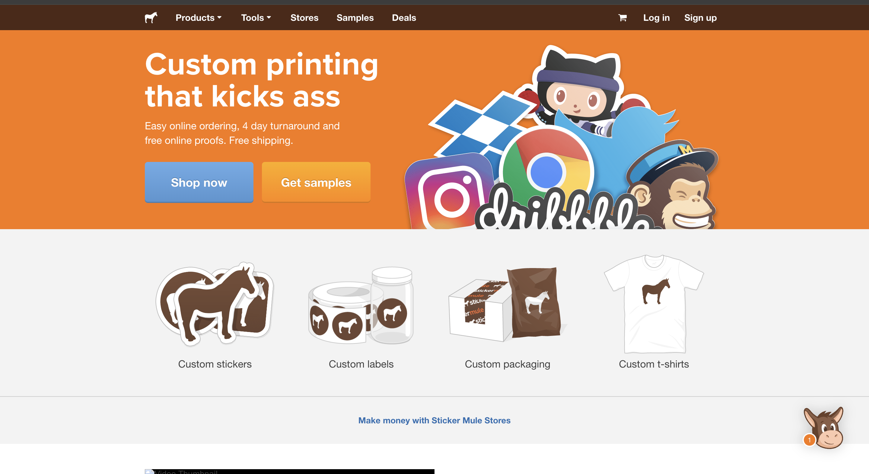
Stickermule is testing and offering a sample at a low price to maximize conversions. There are other standard pricing plans available but the page is focused on just getting the product into the buyer’s hands.

Source: Stickermule
If the sample price is so low that it’s purchased only for the price, that could be an issue because it means the shopper didn’t digest what you're selling for regular prices.
But it isn't as bad as it looks. This way the company gets the customer to try the product, and those who like it will always drive higher long-term value.

All in all:
- Let your CTA or call-to-action buttons allow visitors to buy a sample or try some of the features of your product for free or at a low price.
- Make sure they understand what you are all about before they checkout with their preferred pricing option.
- Help visitors see the quality of your features or products without being burdened with spending a lot of time or money.
This example shows how even well-designed pages benefit from ongoing optimization and clarity.
As Patrick Campbell, CEO of ProfitWell, notes, 'Your pricing strategy is one of the most important levers for growth, yet it's often the most overlooked.’ Here, he discusses aligning price changes with value metrics.
Here's how you can optimize your experimentation efforts:
High impact, low effort
- CTA button variations
- Plan positioning
- Feature highlighting
- Price anchoring strategies
High impact, high effort
- Payment flow optimization
- Plan structure revisions
- Feature bundling options
- Onboarding integration improvements
Next, see how you can optimize your pricing page in the best way possible.
6 Pro tips to optimize your pricing page
1. The ethical tightrope: Price testing
As a first step, we could easily suggest that you A/B test your pricing page, but is it ethical to do so?
Let's break it down:
- The good: It helps you understand what potential customers value
- The bad: It can feel manipulative if not done transparently
- The ugly: Inconsistent pricing on a landing page can damage trust
All in all, price testing can be ethical if it's transparent and uses the data to provide better value rather than just maximize profits.
Instead, show your customers what they're missing without your product. Make 'em feel the FOMO through an interactive experience.
- Highlight the problems they'll face without your solution
- Use comparison tables to showcase what they're missing
- Tell stories and testimonials of successful customers who made the leap
Example: When analyzing their pricing page design, Basecamp found that displaying annual plans more prominently led to a 14% increase in conversions to paid plans.
2. Make your offer the real MVP
Your product's value is more important than its price.
According to OpenView's 2023 SaaS Pricing Strategy Report, competitor pricing (37.5%) is a commonly-cited pricing strategy, followed by value-based pricing (32.5%) and cost-plus pricing (29.5%).
While many companies are still focused on competitive positioning, there's a growing trend towards value-based pricing.
What you're offering to customers matters far more than how much you're charging for it. A great product or service can justify its price, but a low price can't make up for a subpar offering.
Here's why:
- A strong offer can justify a higher price
- It differentiates you from competitors
- It creates perceived value beyond the price tag
As a business, define the issue you're tackling before even thinking about price.
Further, offers personalized experiences. Companies are also exploring AI-driven personalized pricing. It tailors offers depending on user behavior and individual preferences.
3. Don't slash prices
Slashing prices just so potential customers can click on the buy now button is like cutting your own hair.
Discounts feel good at first but leave you with regret and a devalued brand. They:
- Train customers to wait for sales
- Can signal desperation or low-quality
- Reduce your profits faster than you can say "bargain"
Instead of lowering prices, create value-added offerings and transparent pricing.
Try offering exclusive content or user-friendly features. Provide stellar customer support. Include complementary products or services.
This clear pricing template keeps your prices stable while giving customers more reasons to take out their credit cards and choose you.
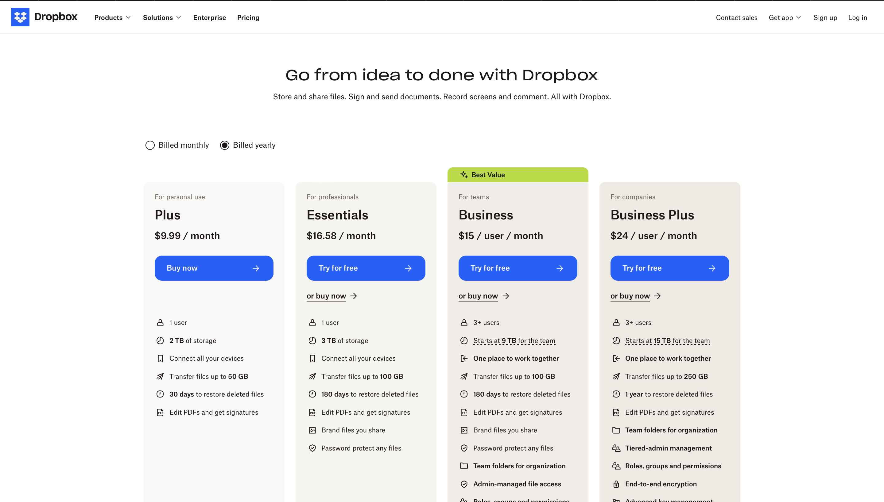
Example: Dropbox allows users to choose a plan that best fits their requirements, and as their needs grow, they can seamlessly upgrade to a higher pricing tier.
Source: Dropbox
4. Tackling the penny-pinchers
Got price-sensitive customers? Try these strategies:
- Tiered pricing: Offer different levels of service
- Bundle deals: Combine products for added value
- Loyalty programs: Reward repeat customers
Example: In the e-commerce sector, Amazon's 'Subscribe & Save' pricing strategy has been particularly effective in driving customer loyalty and increasing average order value.
5. Free plan: The gateway to paid features
SaaS companies often have expensive products. To solve this challenge give your customers a taste of your product features for free, and they'll come back for more. Here's why it works:
- Low barrier to entry for new users
- Showcases the value of premium features
- Creates a sense of investment in your product
However, make sure to streamline your free tier is valuable enough to hook users but limited enough to encourage upgrades.
Example: Optimizely lets you try feature flagging for FREE on their saas pricing page.
Source: Optimizely
6. The comparison effect: Ethical tricks
Use the power of comparison to guide users to a preferred pricing package. Here's how:
- Introduce a slightly less attractive option near your target plan
- Make sure your preferred option and add-ons stand out visually
- Use clear, distinct value propositions for each tier
Example: Casper Mattress page has a comparison table that compares the mattress you're looking at with Caspers’ higher-end model.
Source: Casper
This way plenty of visitors end up buying the base model because it feels like such a better deal comparatively, leading to higher conversion rates.
Know your metrics
To effectively monitor your pricing page performance, track these key metrics:
Primary metrics
- Conversion rate by pricing tier
- Average time to decision
- Exit rate and exit points
- Return visitor conversion rate
- Mobile vs. desktop performance comparison
Secondary metrics
- Feature comparison interaction rates
- Help documentation access frequency
- Chat support engagement levels
- A/B test impact measurements
The moral of the story...
Don't (just) make it pretty!
Since the rise of e-commerce and SAAS businesses, pricing pages have become the digital storefront.
But, your oh-so-obvious 'We're worth every penny' and 'Our features are amazing' claims aren't always enough to convince customers anymore.
So, having customizable options on your pricing page isn't just about making it pretty. It's about simple pricing, onboarding well, and:
- Nailing your value proposition
- Adding value through use cases instead of slashing prices
- Testing, iterating, and optimizing your pricing table
- Being transparent about your pricing and list of features
- Helping customers make the best choice
- Avoiding manipulative tactics and offering social proof
- Regularly analyzing user experience
The perfect pricing page takes time, attention to detail, and regular tweaking to get it just right.
![]()

