50 mobile app development tips for acquisition, engagement and retention
It’s more important than ever to stand out from the crowd. To be talked about. To be remarkable. The question is: How do you develop a mobile app that is so valuable that people use it every month? Every week? Or better yet – every day?


As of July 2023, there are over 1.6 million apps in the App Store and 3.55 million apps in the Google Play Store.
But with so many apps continually being introduced, users have high standards for what they download, use regularly, and recommend to their networks.
Poor UX design, unintuitive interface, poor performance, and instability represent the most common reasons for users losing interest in or uninstalling an app. Experimentation helps you to avoid those issues, keep people interested, and keep them coming back.
We consolidated the best product experimentation tactics into a list to help software development teams, mobile product managers, and marketers develop mobile apps that are built to last and where users would spend time every single day.
User acquisition strategy
Tips on acquiring new app users.
1. Build a product that solves a problem: Really amazing apps solve a glaring problem for any development company. Do you hate standing on the corner on a freezing cold night in an attempt to try to wave down a taxi cab? Use Lyft. Do you want to learn a language but don’t want to commute 45 minutes to sit in a classroom? Use Duolingo. Solve a problem. And do it in an awesome way. This will drive word of mouth referrals. Speaking of referrals…

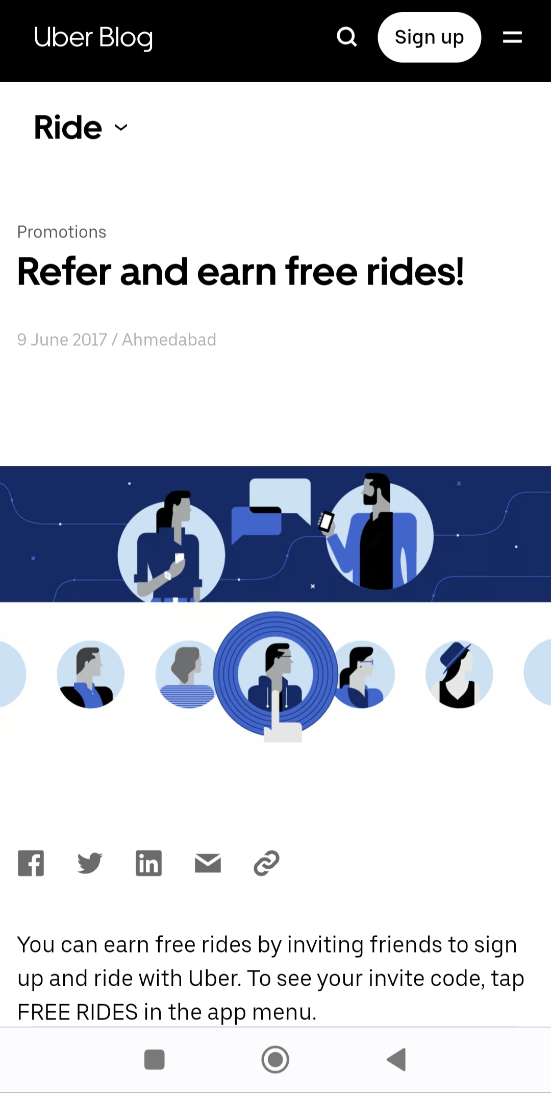
2. Build a referral program: Incentivize your early users to refer your app to their friends. Uber did a fantastic job by offering ride credits for people that referred the app to others:
3. Build a cross-platform wait list: People want what they can’t have. A wait list helps you capture demand and build a database of emails early. When you announce your app is generally available, you’ll have a long list (hopefully thousands) of people ready to download it. You can easily build a website landing page through platforms like Wix.com, Unbounce, or Squarespace and use this to capture email.

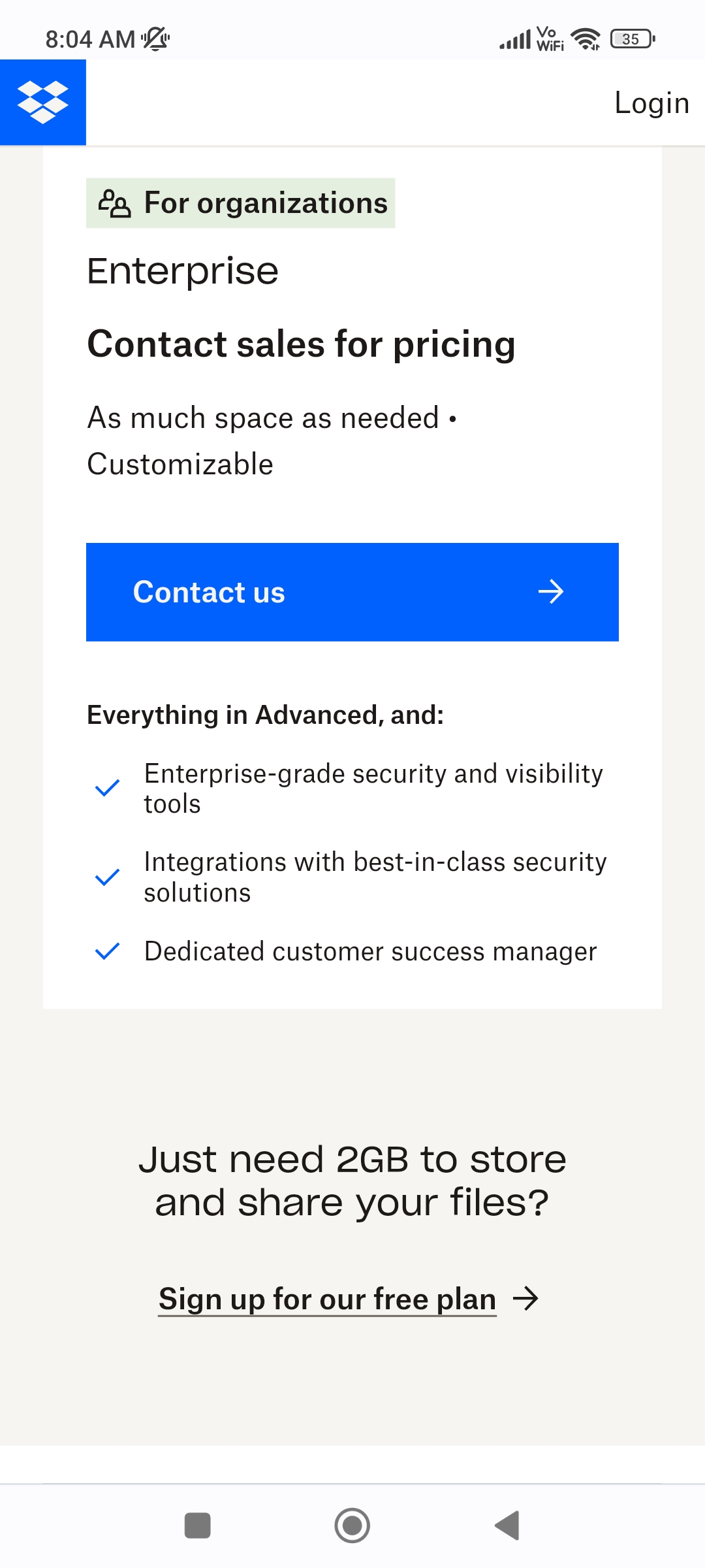
4. Leverage a freemium model: Make your app available for free with a freemium model. It’s possible you’ll get more downloads in a free version of your app. You could then offer the option of purchasing virtual currency for premium features.
Dropbox has a freemium model that offer 2 GB of free storage.
5. Make your paid app free for a limited time: Not a fan of the freemium model? No worries! Make your paid app free for a short promotional period and promote it to various publication outlets like Forbes Tech and The Guardian or a publication that's popular in your location.
6. Write and promote content about the problem your mobile app solves: Produce content that adds value to your customers: whether it’s blog posts, eBooks, videos or webinars. Target topics and keywords that are related to your app so you reach the right audience. If your content helps people overcome challenges, you’ll be perceived as a thought leader and expert in the space. Promote the content on your blog and social media channels to drive network effects.
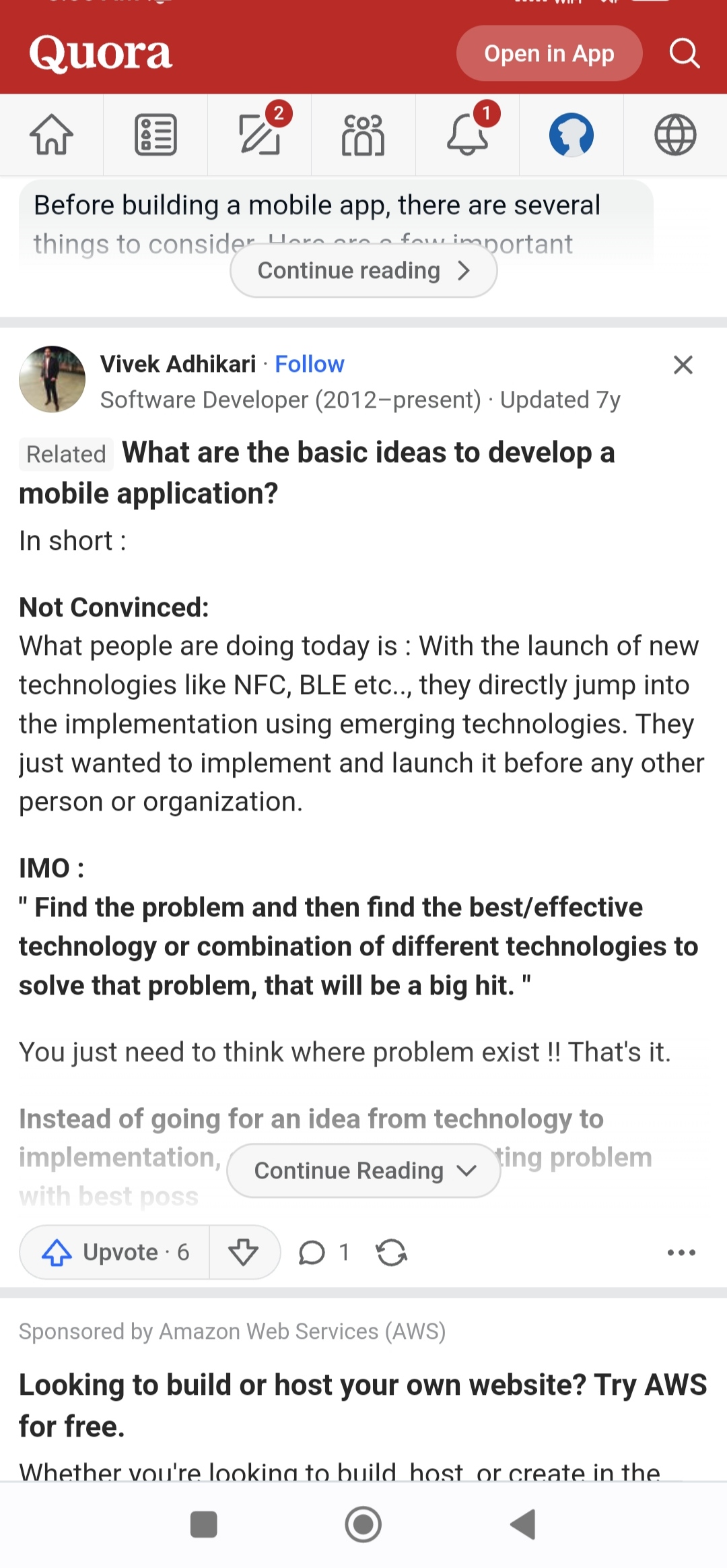
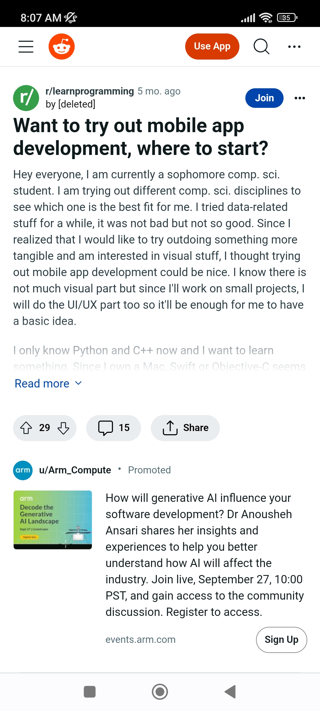
7. Answer questions on Quora and Reddit: Target questions that center around pain points your app solves to help build awareness around your target audience. If you offer a really valuable answer, the Quora or Reddit teams could recommend your article to their audiences.
8. Attend and host local marketing events: In our world that’s so driven by swipes and texts, remember how impactful in-person events can be in building buzz. Hosting an event could help you build a community of champions that could become the foundation of your app’s success.
9. Consider the paid acquisition route: If your organic marketing and in-app growth levers aren’t growing your users effectively, explore the paid acquisition route on different channels. This is especially helpful if you operate in the e-commerce space.
Keep three questions in mind when using paid acquisition:
- Is the cost of acquiring this user justified by the lifetime value of that user?
- Have you stack ranked your acquisition channels based on ROI?
- Do you know which paid acquisition route is actually leading to the app install?
Use mobile attribution tools like AppsFlyer, Adjust, Singular, and Branch to find those answers.
10. Reach out to the press: A press release is a great way to drive short term awareness and will often lead to a spike in downloads. Reach out to publications like TechCrunch, VentureBeat, CNN, Forbes, Fast Company, Entrepreneur, Business Insider, Inc. Don’t worry, you don’t need to be in PR to pitch the press. Look up editors from each of those publications on LinkedIn, craft a short message on how your app is a game changer (use app metrics where you can), give them access to your app as well as screenshots so that they can get a sense for how it works.
11. Create strategic partnerships: Look for mutually beneficial partnerships that can expand your app’s reach to more people. For example, if you’re developing a workout app for biking enthusiasts, you could reach out to local bike shops (or even a national brand) and offer an exclusive special premium feature in the app for their shoppers in exchange for their help with promotion.
12. Cross promote in your other apps: If you have more than one app in the store and they’re in similar categories (for example, gaming), you can add in a call to action to promote your other apps.
[old image]
13. Experiment with how you ask users for reviews: Ratings and reviews are one of the most visible components of an app’s listing and do influence a person to tap through or download. Reviews are social proof. If all these other people like it, then it’s probably good.
App discoverability
These are tips for App Store Optimization (ASO) and ways you can make your app more discoverable in the app store.
14. Understand how powerful ASO can be: App Store Optimization is the process of improving the visibility of an app in the app store backend. The idea is to drive more people to your app page so that they download your app.
Here are great tips to get you started with ASO.
15. Pick relevant keywords: The first thing to consider when optimizing your app’s visibility is keywords. You should choose keywords (words or phrases) that are relevant and truly representative of your app. For example, if your app provides dog walkers locally on demand, the keyword “dog” by itself may not be that valuable because it doesn’t indicate download intent for that specific use case. The phrase “dog walker” however, could be a much better indicator of intent. After all, when someone finds your app, you want a conversion to occur (meaning you want them to download it). If a person comes across your app listing by unrelated search terms/phrases, they probably aren’t your target audience, and probably won’t download your app.
16. Consider keyword competitiveness and traffic: Consider how competitive those keywords are. Look at the total number of keywords you’re competing with. If there’s too much competition, aim for another keyword.
17. Consider keyword placement: There is a clear correlation between having a keyword in the name of an app and ranking for that keyword. Most apps that rank for high traffic keywords have the target keyword in their name. But do be careful because you app may be rejected for spamming if you use the keyword too many times.
18. Determine keyword weight: The keywords included in app titles (for both iOS apps on Apple devices and Android apps on other mobile devices) are by far the most heavily weighted in the algorithm. If you want to improve your rank for a specific keyword, putting it in the title is your best bet.
19. Target multi-word or long tail keywords: A common mistake that app publishers make is to only target single-word keywords. Then they wonder why their app’s rankings are so low. Multi-word keywords are usually searched for less often, but will also be less competitive.
You’ll automatically rank for combinations of your single-word keywords but target phrases, or “long tail keywords” because they can be much easier to rank for. Targeting the long tail is a great place for new developers/new apps to start.
20. Have an eye-catching Icon: The icon makes a huge first impression. Have you tested different variations? You can do this by testing out various designs on mobile advertising networks, like Admob, Google Adwords, and Facebook, and then measuring how potential app users react to different versions there before rolling it out in the app store. Another quick tip: you generally want to avoid putting the name of your app into your icon.
App performance
Make that first user experience unforgettable.
Studies show that if your users have a bad first experience, 65% of them will delete your app. Experiences are made up of more than slick UX design, intuitive usability and modular code. The infrastructure and performance are key players in your app’s success. Here are tips to make sure your app runs fast and smooth.
21. Monitor your app consistently: Factors outside your control affect your mobile application development. Cloud services, device upgrades, or even other apps can influence how your app behaves. And an update to the OS can dramatically increase crash rates in your native app. Monitoring your app’s performance through all variables will keep you from having to be reactive when issues occur. A performance management solution gives you visibility into your apps while they’re in production, so developers can be proactive and resolve issues as soon as they’re detected. But it also continues to give you insight on all the above mentioned (latency, crashes, transactions) and more, while your app is in the wild. You can also leverage phased roll outs with Optimizely to mitigate risk.
22. Choose a proven cloud provider: Crashes aren’t everything. Network performance can also affect the user experience. Everyone hates the spinning wheel that indicates network slowness, but it’s hard to simulate these conditions during dev and test. So choose a solid cloud provider!
23. Pay attention to performance in the real world: Your work isn’t finished when you launch on an operating system – in fact, it’s just beginning. It’s not enough to monitor your latest app version. Retail apps, for example, often have high conversion rates on the oldest versions of their apps, so you need to make sure that those users are supported well. Nothing is like releasing your app into the wild where hundreds of millions of variables can impact its performance.
Analyze user behavior
Do you have deep insights into your users? To really drive user growth, improve retention and increase monetization, you’ve got to have deep insights into user behavior. Your Application Programming Interface (API) and analytics will help you achieve that.
24. Understand the 3 levels of complexity for app analytics: There are 3 levels of metrics that app makers smartphone should look at There are 3 levels of metrics that smartphone app makers should look at to achieve swift success. When you’re getting started, you should make sure you’re tracking level 1 goals but as your organization grows and gets more sophisticated, you should look to expand to more complex levels of analysis to form a holistic view of your app’s performance.
Level 1: Counters (DAUs, MAUs, Revenue)
Level 2: Where are my problems (Funnels, Retention, Segmentation, Events)
Level 3: What drives growth: Behavior-Based Cohorting / Data Science

Image from Amplitude Analytics
25. Measure your Level 1 analytics: Metrics typically measured here include MAUs (Monthly Active Uniques), DAUs (Daily Active Uniques), page views and revenue. These metrics are absolutely important and give you a baseline of your app’s success with regards to engagement, retention, and monetization.
These metrics are a great start, but how engaged are your users?
26. Measure your Level 2 analytics: The metrics you’ll measure in Level 2 help you track events to give you a high-level picture of user behavior (ex. how many actions users take per day, what actions are most common, what actions are users not taking). This allows you to locate any problems occurring in the app. From there, you can create different segments of users based on behavior (i.e. active users vs. inactive) or demographic (i.e location, age). and glean a deeper understanding of how different types of users interact with your app.
27. Measure your Level 3 analytics: Level 3 is where you uncover your secret sauce on what drives growth. Which behaviors correlate to lifetime value? Applying predictive analytics to your data will help you uncover potential improvement areas that could dramatically affect the trajectory of your app.
Optimize app UI design
These are tips focused on how to understand qualitative feedback about how people are interacting with your app to improve your mobile UX during the app development process.
28. Leverage heatmaps to understand user focus areas: How are users physically interacting with your app? Where do they tap, swipe or pinch? Touch heatmaps are a key UX analytics feature. Touch heatmaps aggregate all users’ gestures (taps, swipes, pinches) and help you see where on the screen they are (or are not) focused. These are some questions heatmaps help you answer a very important question: Are users paying attention to the things you want them to pay attention to?

29. Watch recorded user sessions: When you’re building cross-platform apps using development tools, watch recordings of real people using your app to understand exactly how people interact with your mobile app design.
30. Deconstruct your funnel to start building an A/B testing plan: A/B testing enables mobile app makers to improve their key metrics and KPIs by trying out new designs for everything from signup flows, gating features, messaging, review process, in app referrals, onboarding flow, guiders within the app, discovery of features, checkout funnel and CTAs.
Mobile developers and mobile product managers are increasingly adding mobile A/B testing SDK and feature flagging to make their apps more engaging.

31. A/B test all app updates to reduce risk. Any mobile app developer will tell you that releasing new features in an app or changing aspects of the underlying architecture can be risky business. This means the stakes for app updates are high and PMs should do everything possible to ensure they are high quality in real-time. If something isn’t caught, an app update could include bugs or interaction issues that damage the user experience or unexpectedly tank business metrics.
App onboarding flow & mobile A/B test ideas
Onboarding is the process of turning a first-time user into a repeat customer during their first interaction with your app. Here are tips to improve your mobile app onboarding hook and educate educate, so new users feel well-equipped and excited to continue using your app.
32. In onboarding, test different login/signup options: Don’t just build apps. Focus on how people want to log in or signup to use your app. Is signup necessary at all? Maybe your users prefer to login by email and password. Test prioritizing different options

33. In onboarding, test previewing the in-app experience: You can show users previews of the in-app experience, mentioning specific features and their value. This is a smart hypothesis to test to measure whether it drives more engagement or activation.
34. Test the order of your user onboarding tour: Experiment with the order of your onboarding tutorial. Which steps should come first? How many steps are included?
More test ideas for your user onboarding tour.
35. Test the CTA button: A call-to-action is your MVP. What’s the right size, copy, color, location for your CTA? If it was larger, would that make people notice it more and ultimately increase conversions?

36. Test changing messaging and help text: Changing the messaging in your app to be user-friendly can dramatically change the game. For example, instead of “We will not spam you” why not try “We respect your privacy.” You'll see an increase in conversions!
37. Test different navigation layouts: Try testing different navigation layouts.
38. Test removing distractions from your CTA: If you have other elements on the screen near the CTA, try removing them so that it makes things simpler for the user experience.
39. Test progress bars in your onboarding tour: Good mobile onboarding flows should quickly teach people how to use the app. Progress bars can be a valuable way to encourage people to finish a tour because they give people a sense of achievement as they progress in usage of the app! Duolingo does an amazing job of this. Every time you answer a question correctly, an indicator marks your progress.

41. Test discovery functionality: Test how users discover new products or experiences within your app. For example, Instagram lets users tap a banner to discover new people. What if they simply started inserting suggested Instagrammers for you to follow in your feed? Would that boost user discovery?
42. Test targeting images to different audiences: First, identify your primary audience. Let’s say you find out that your audience is primarily made up of the 21-30-year-olds primarily using iphones (apple app store). An an example, the 7-minute workout app could test out using images of people in that age group to see if that might drive more engagement.
43. Test discounts: If you rolled out a special promotion for mobile platforms, would that drive additional conversions and would the revenue from those additional conversions cover the cost of the discounts?

44. Test leveraging video in the app: Most open-source apps today leverage automation and images from their toolkit for the onboarding flow or guided video tours to explain how to use the product while you in the app.
User retention
These are tips for retaining users and preventing churn on an app development platform.
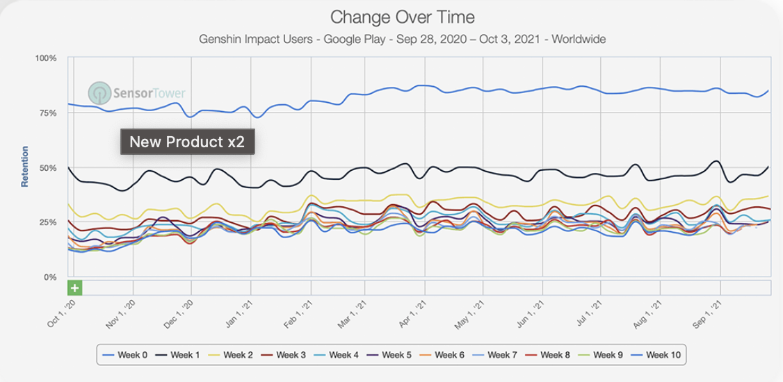
45. Create a habit forming experience in the first 3-7 days: A great first-time user experience is key to retention. The average app mostly loses its entire userbase within a few months, which is why of the >3.55 million apps in the Google Play store, only a few thousand sustain meaningful traffic. There is leverage in improving retention curves in how the product is described, the onboarding flow, and what triggers you set up to drive ongoing retention during your android app development phase.
Whether it’s a frontend push notification at the same time everyday or every week, think about habits you can try to develop in your app users to bring them back.
46. Include social elements to create network effects: MapMyRun created a feed for their native application where you could see your friends’ recent runs and encourage them with likes and comments. It helps to make running more fun, engaging and competitive!
47. Leverage push notifications thoughtfully: Kahuna’s data shows that by using push notifications, companies can expect a 45% retention rate for 30 days; a 125% increase over consumers who either did not receive or who did not opt-in for notifications. One great way to create urgency with push is to create a time bound or time-sensitive campaign.

48. Consider timing and responsiveness, especially for global audiences: Sending a push notification to all your users at a specific time may not work with a global audience. For example, a push notification in the morning for a California user at 9 AM would send that same notification to someone in Spain at 6 PM. Be thoughtful in terms of segmenting your users by time zones. It can make a huge difference!
49. A/B test opt-in messages for notifications: The average short- and long-term retention rates for users who have opted in to push notifications are more than twice as high than rates for users who have not opted in. Make sure you’ve clearly highlighted the value to the user of why they should opt in, especially if you’re a startup and end users don’t know about you.
50. Segment your users to drive effective campaigns: For example, a dormant user you’d like to revive would receive a very different push notification from an active user. You could use an offer through push to “reactivate” them!

We hope these 50 mobile app development tips help you to make your app amazing!
